Sunday Times 2
Winning in Cannes
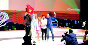
View(s):Sri Lankan Kum Kum Fernando working as Associate Creative Director of Lowe, Vietnam was part of the LOWE Vietnam Team that won a Gold and Bronze at the Cannes Lions International Festival of Creativity held from June 15 -21 in Cannes, France.
The Cannes Lions International Festival of Creativity, has been recognising the best in communications since 1954. It has grown to become the world’s biggest celebration of creativity in communications, with more than 35,000 entries from all over the world and more than 12,000 delegates from 94 countries in attendance at Cannes, France each year.
Kum Kum is a product of S. Thomas College, Mount Lavinia and RMIT University Australia
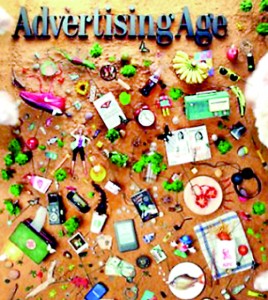
For the fifth year, Ad Age invited young creatives from around the world to design the cover of issue that is distributed at the Cannes Lions International Festival of Creativity. Kum Kum also won the Young Creatives Cover Competition.
| Fish Tale: The Story Behind Cannes Issue Cover
There was a day to go until the deadline for the Ad Age cover contest. Kumkum Fernando of Lowe Vietnam was at work on his submission – involving a complicated array of props, from a bottle of Absolut to a Mr. Potato Head to a real fish — and it was almost ready to be photographed. Then there was a power outage, relatively common in Ho Chi Minh City. This one lasted more than five hours. The fish was starting to smell. Mr. Fernando started out at Grant McCann Erickson in Colombo, Sri Lanka before moving to Lowe Vietnam, where he’s worked for clients including Coca-Cola, Unilever and Dutch Lady milk. On the side, he makes art installations for cafes and bars, drawing on a huge stash of objects he’s collected since he was 12. Favourites include World War II circuit boards, antique spoons and African masks. For the cover challenge, the brief was to show “the meaning of creativity in 2014.” Mr. Fernando created an installation to show that everything is connected in the contemporary world. “I feel like brands also have an invisible line connecting them to each other,” he said. The installation’s starting point was a red Nike shoe from a friend (“my shoes are too worn out,” he said.) The toys were also borrowed from a friend with kids: “The Barbie isn’t mine,” Mr. Fernando clarified. Since the issue has a Cannes theme, people might assume Mr. Fernardo was inspired by the French Riviera beach for his sandy backdrop, but that’s coincidental. A white backdrop he tried first didn’t look right, so he used sand instead. The installation was about 8 by 10 feet and was topped by an Ad Age logo that he had laser-cut in plastic. To shoot it, he mounted the camera on an arm. That still wasn’t high enough, so he put the arm on a scaffold. The whole process took three to four days, with help from a few friends. |


